I close taste to all the world’s leeching,
listen to foto nous empty,
sight to never glancing cliché prancing,
scent to but that’s how it’s always done.
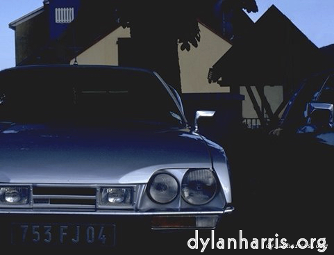
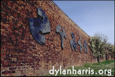
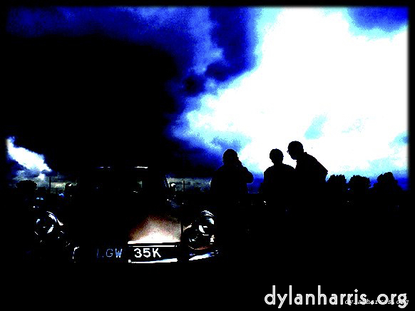
Do you see shapes? Intersect shapes?
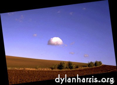
Do you see the counter container?
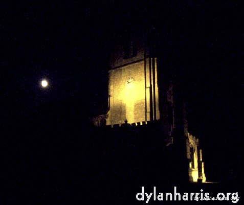
Sometimes it’s just not there.
The image fundamental, the form dominator,
the geometric axes, the container: the border.
Landscape’s lines: image lines, hinted lines,
tangent lines, angle lines, each line edge defined.
White backgrounds leech line.
Black strengthens.
Don’t believe me?
Compare.
My site’s consistent.
No for–web tools for me;
there’s none presumption–free & cheap.
Consistency’s a look simple and complete.
If some pages demand black,
all pages shall have black.
My poetry belongs to the dark.
Poetry, the art of speech,
weakly interacts with print,
beyond the mechanic vital.
Poetry colour is music colour;
this black is harmony.
I want work awake, not wallpaint.
I want sharp, not brochure.
For those who don’t believe, here’s some of the same photos, leaking form horribly on a white background.
2022 addendum: I was decades ahead of my time; dark backgrounds are now ubiquitious.
