reflets
Preface
At La Défense, just outside Paris, is le moretti, an installation by the French artist Raymond Moretti. It’s a series of coloured glass tubes running vertically down a four–storey chimney (which carries away fumes from a motorway junction, other roads, a railway, a metro, a tram, and some parking). The installation, when reflected in the glass walls of the surrounding buildings, produces so many beautiful distortions that I’ve found myself taking far too many photographs.

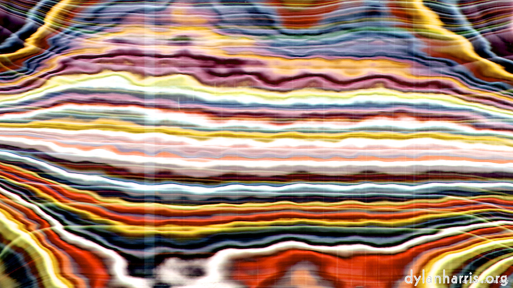
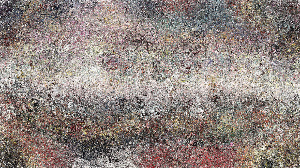
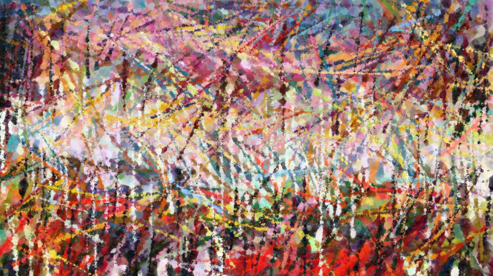
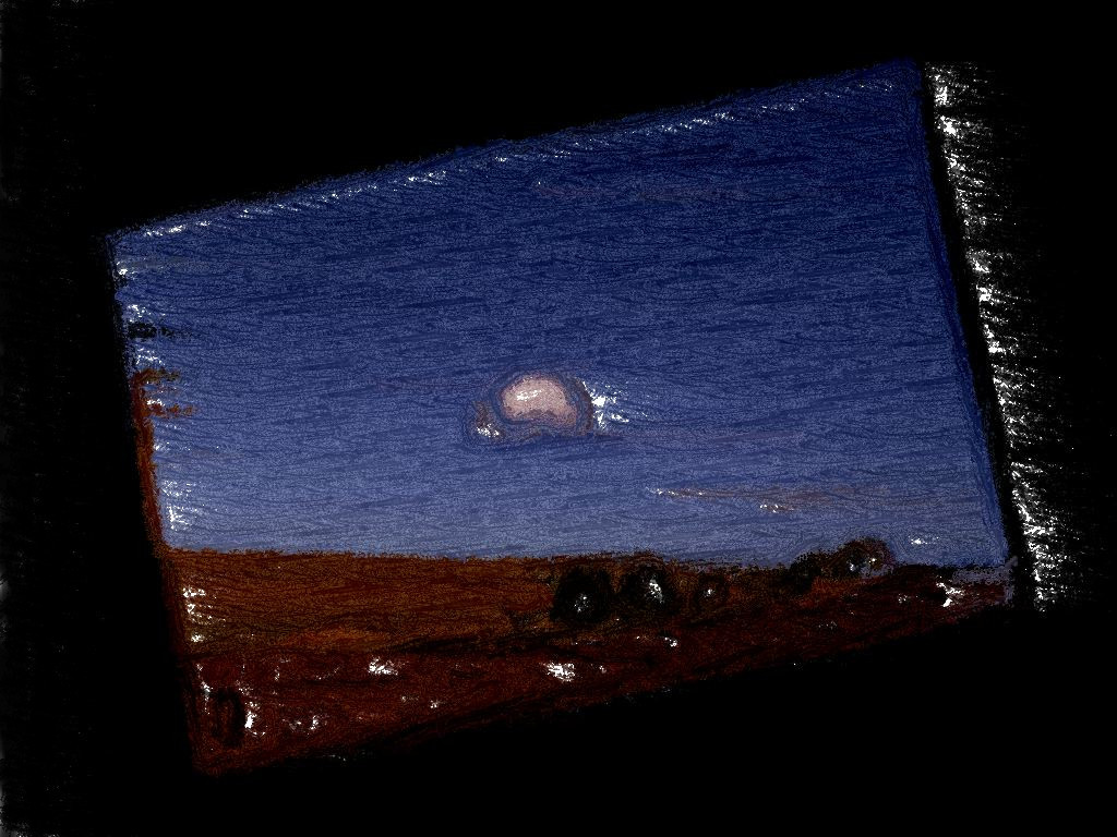
I selected this photo, from paris (lxxxii), for a series of secondary reflections produced in software using Synthetik’s rather brilliant Studio Artist. Every image you find on these pages is this photo reflected through a standard Studio Artist preset. The images are organised as per the presets in version 4.0.4 of the product.
This project has a secondary goal, to provide a comprehensive photographer’s perspective of Studio Artist.
A photographer’s perspective
If I were to take a photograph through a piece of muslin, or net curtain, I’d get a smeared white overlay on the image. It’s got a rather dreamy quality. Photographers are always interested in effects like this, for both artistic and technical reasons. Some effects are made when the photograph is taken, others when it’s post–processed. Furthermore, it’s important to understand effects so you can avoid those you don’t want.
From a photographer’s perspective, Studio Artist is a package of sophisticated and rather clever artistic effects.
The problem with effects
There are a good number of packages on the market to provide special effects to photographers. In my personal opinion, these can be categorised to:
— solve technical problems;
— recreate analogue effects, such as grain;
— digitise darkroom effects: cropping, correction, etc.;
— lazy copy–the–crap me–too stuff.
It’s the latter category that annoy me. These effects are marketed with the claim they provide creative tools to the photographer, but they always seem to be tired me–toos, offering much the same absence of ideas as the other guys. They almost always market the product using the word creative, yet there’s nothing creative in copying another company’s rubbish. They are to photography what standard english is to poetry, apparently useful but actually harmful, encouraging laziness through rote learning of rules, rather than rewarding exploration and innovation.
Yeah, yeah, yeah, if this were a serious piece of writing, I’d come up with some examples of what I’m complaining about. But it isn’t, and, anyway, I’ve been inspired by the copy–king laziness. Actually, this piece is about what I do like, not what I don’t.

I find the real world offers more interesting effects that most of these products. Most of the images on this website are photographs. The only effects applied are darkroom effects: cropping, straightening, contrast, and so on. I find the results far more interesting than most effects packages, and all I do is what every photographer should do, I open my eyes.
My photography uses mold, windows, water, and other real world things. For a long time, I’ve wanted to find a way to reproduce the same process on images of my choice. Most commercial effects packages offer a deeply unimaginative and dull range of rien: they offer nothing. Most, but not all.
I found an exception: Synthetik’s Studio Artist. Synthetik offers espresso to their competitors’ dishwater. They offer antibiotics to their competitors’ homeopathy. Perhaps this is because Studio Artist comes from a completely different place to the photography software companies. Perhaps it is because the company was created by someone who is clearly passionate about his subject.
It is a rich and sophisticated package. What I do here is castrate and hobble the potential of their product. You do not see the process by which these images are created. You rarely see the components that create the images. I make no effort to control the effects, I use the defaults throughout. The presets are designed to be combined, I’ve combined nothing.
Where might this go
In Studio Artist, you can design and implement your own effects. Perhaps I might explore this in my own work. There are some things I want to do that I’ve been unable to do, such as follow up on my moldy photographs. This product might be my route forward. I don’t know.
It is the only package I know that might offer me the chance to make my choice of photographs moldy, and do so in a couple of minutes rather than twenty years. Perhaps I could chose what reflections to put in the skyscrapers’ windows without having to build a 200 metre thing–to–be–reflected first. Perhaps I could chose which reflections appear in the water, perhaps I’ll no longer be limited to fixed examples of architects’ brilliance. Perhaps I can define the water’s behaviour, rather than waiting for the right waves in the right wind in the right light—and that’s an example of the real reason why many photographers are interested in, and disappointed by, many supposédly creative effects.
There’s often a group of people who hold that such–and–such technology doesn’t represent the true art, whatever that art is. I agree it’s important not to lose existing skills, but I go no further: my head is simply too big to fit in the luddite bucket (yup, I said that: after all, this site is called arts & ego).
Studio Artist offers the adventurous photographer many roads. One road it does not offer, though, is to turn a photograph into a painting. An essential part of a painting, particularly an oil painting, is the physical texture of the paint. It will be a few years yet before printing technology can offer both texture and colour. Right now, you can use ordinary printers for full colour, and 3D printers for texture, but not both together. That will come, but it’s not here now. I am where I am.
Studio Artist does give the photographer access to the appearance of texture. That I can use. Texture says something.
I do intend to explore programming of presets at some point. There’s some natural effects I’ve photographed that I’d like to be able to reapply to any image, not just that happened to be there at the time. I don’t know whether I can recreate any of them with Studio Artist, but I intend to try.
Also, my poems big town blues need a video. Something built using these images should work, re both technology and art. I don’t think it’ll be enough to put a fixed set of images to each poem, though. How I assemble things, if I do, is something I’ve not decided.
The process

All the presets were applied to the same base photograph, which you can see at the top of this page. I let animated presets run until the canvas was covered, or it had finished. I often repeated a preset that left a lot of whitespace, so some images are versions of their predecessors.
Entropy seems to be an important part of some presets. When certain presets are run, the results may differ from a previous run of the same preset with identical settings. That’s one reason why these images are a guide to the feel of a preset, not an absolute statement of what the preset produces.
Some presets only worked on a particular background. I defaulted to plain white, to complement this site’s black background, but sometimes a preset didn’t like white. A few preferred black. Some didn’t do anything until I started with a copy of the original image. I couldn’t work out one or two presets at all, and gave up on them. That’s why this set of preset images is incomplete.
Partial application
It’s not unusual for the darkroom process, or its modern digital equivalent, to apply an effect to a particular part of an image. For example, an interesting corner may be overexposed because it was in the sun, so that part of the photograph is carefully underdeveloped when printed. An effect does not have to apply to an entire image to be important.
Studio Artist is perfectly capable of applying effects to a chosen region of an image, and allows you great control over the application, too, through the use of a stylus (which is much better for detail than a mouse).
However, the goal here is to show what particular presets can do, so I’ve not selectively applied them. Each preset is applied to the entire image, without intervention beyond controlling start and stop. I want to let photographers see what Studio Artist could do to their photographs.
One section, the msg section, uses the original image to produce something completely different, according to Synthetik. I’ll be honest, I’m often at a loss to see the relationship between the two, but Synthetik have written an explanation.
Presentation
These reference images are organised as per Studio Artist 4.0.4. The presets were reorganised after that release. The sections can be found in the menu on the top right of this page. Each section has a number of categories, which themselves contain images produced by the presets. Many categories have a number of pages of images. The menus expand and contract to reflect those categories and range of images.
These reference images only give a hint of the capabilities of the software. I’ve made no attempt to mix textures, direct or control the presets, record any movies, or do anything of the many other things that can be done. I simply want to catalogue the basics before I go on to explore the potential.
