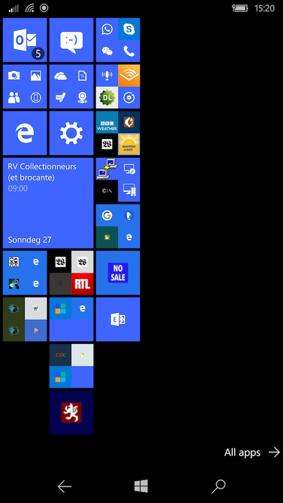
I’ll say it straight away: Microsoft wins outright on their presentation of the phone. The Windows interface is colour consistent, makes it possible to easily see what you need to find quickly, allows easy reorganisation to the users’ tastes and foibles, and is by far the better of the two interfaces.
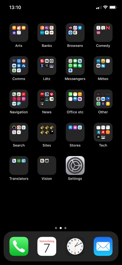
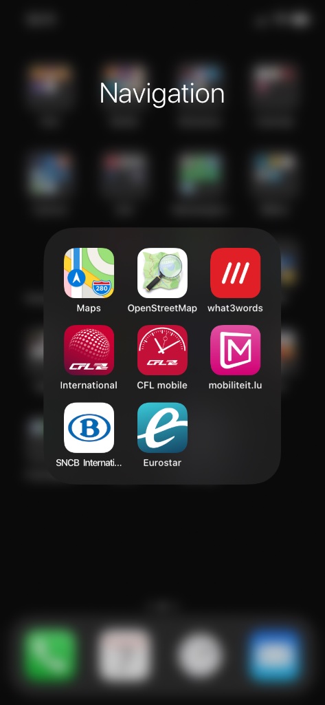
The Apple iOS interface looks like someone ate a curry and threw up on a chess board. It uses icons. There is little or no colour coördination between icons, the layout’s form is a visual dripping tap, the user has a little gross control and no fine control over icons’ placement or appearance, and the icon order is, by default, completely disorganised.
If you want to find an app on the Windows phone, you look, and there it is. If you want to find an app on iOS, you search between pages and pages of visually confusing mess. There’s nothing distinctive in the layout at all. iOS’s finder is such a wasted opportunity.
Apple should throw out this mess and replace it with something dramatically better, like, for example, Windows Modern. Apple could redeem themselves slightly, by switching to monochrome, so at least getting rid of the colour confusion. But really, though, I can’y believe, after god knows how many decades of user interfaces, that Apple are so utterly stuck in the past.
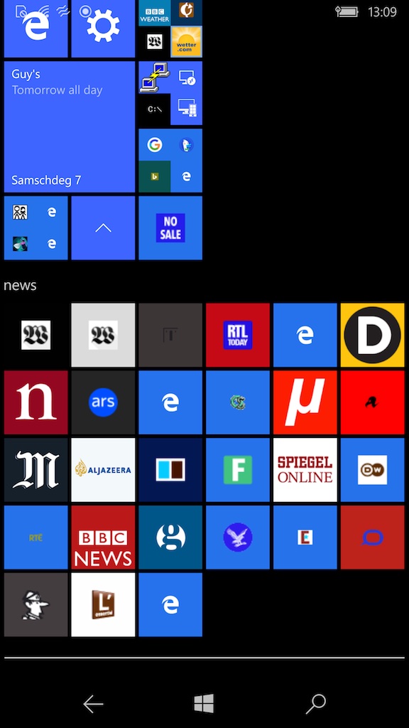
In these screenshots, you’ll see that I’ve put the tiles on my 950 XL to the left of the screen. This is actually so I can quickly shove the phone in my pocket without starting a random app, when, for example, a ticket inspector suddenly appears over my shoulder. I cannot do that on the iPhone 11.
You’ll see immediately that the icons on the 950 XL are pretty much colour consistent (I chose the blue). You’ll see that no space is wasted between the icons, because they actually look good, and fit, together. None of this is true with the iPhone.
You’ll see that I’ve made the calendar tile bigger than other items. Indeed, it is possible to make tiles rectangular, larger and smaller. You’ll see that there’s an entry to be read on my calendar. Indeed, many apps offer quick summaries on a large tile. You’ll see that I’ve placed some file in a tale at the bottom. It is very easy, on the 950 XL, to arrange things to appeal to your eye, so you are quickly drawn to what’s important to you. None of that is possible on an iPhone.
You’ll notice some of the icons look like they contain multiple things. That’s one thing that is true on the iPhone. However, on the Lumia, I can put as many objects as I like in a container, and they’ll all visible when the folder is opened, and in fact the surrounding objects remain active. The iPhone limits a folder to nine objects, otherwise you have to turn the folder’s page over to get to more of them. The iPhone tries to copy the idea from Windows, and gets it so utterly wrong.
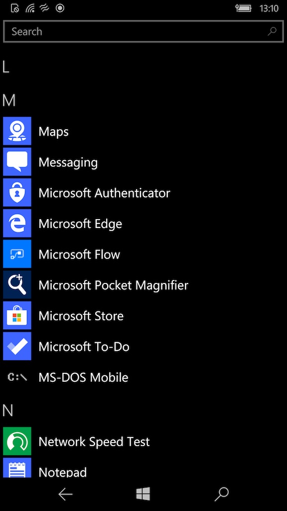
Windows does not force me to put all apps on the front. I keep rarely used apps off the front screen. In fact, the Windows 10 phone a second interface to apps, an alphabetical list, which allows me to find something by name. The alphabet is something that is beyond the ken of Apple, judging by their deeply appalling podcast app.
The very fact that the dreadful Apple user interface is pretty well copied in Android, and that Windows is no longer available on phones, screams design cartel to me. The iPhone interface design is dismal shite, yet it won. There is no way that it could have won fairly. Having said that, Microsoft is not famous for fair competition practices. Clearly the problem is the market, and more to the point its regulation, not the software manufacturers. Shite should never destroy quality.
In these images, I’ve done what I can to tidy up the Apple presentation of apps. I wish I could do a lot more. Unmodified, it presents a continuous sequence of apps in random order, without colour coördination, form variation, or anything to help their visually. I cannot do anything that I did on my Windows phone, unfortunately, so it is not possible on an iPhone 11 to create a properly usable app launcher. Having worked with a genius, I now have to work with a lazy self–entitled daddy’s boy.
In other words, here, Microsoft wins utterly.
